WAE: Scaling Product/Design Ops
Contents
An agency’s vision to solve post-COVID healthcare staffing chaos died on arrival when their expensive, externally-built MVP was delivered non-functional. I was brought in as the product design leader to rescue the project from the ground up. With no product leadership, significant technical debt, and a bloated, rapidly-scaling engineering team, I executed a two-front strategy: first, I ran an iterative research and design process to find the core user need and validate a new product direction. Second, I built a scalable DesignOps system to ensure we could execute on that vision with speed and consistency. This work became the cornerstone of WAE, the new startup that went on to provide countless employment opportunities to underserved communities.
/images/case-studies/WAE-cover1.png does not exist
Engineering-Led Project Burning Cash
Without formal product leadership, the project was led by a rapidly scaling engineering team. This resulted in fragmented workflows, misaligned priorities, and a lack of accountability. With UX and product strategy under-resourced, engineering resources were being squandered on low-impact features, and traditional handoffs between design and development created unpredictable delays, leaving no room for iteration based on user feedback.
Solution
I introduced a two-part solution to fix both the organizational structure and the day-to-day workflow while ensuring a collaborative, user-centered design strategy.
First, I implemented the “three-in-a-box” leadership model, which created a balanced partnership between Product, Engineering, and UX. This elevated UX to an equal partner, ensuring decisions were user-centered and data-informed while giving engineering a clear, strategic roadmap to execute against.
With the right structure and accountability in place, I then rolled out a dual-track agile framework for UX. This created two parallel workflows operating every sprint:
- Discovery Track: Focused entirely on understanding user needs through research, rapid prototyping, and stakeholder workshops. This track validated ideas before they entered development.
- Delivery Track: Focused on building and launching the solutions that were validated in the discovery track, using prototypes as a shared language to ensure clarity between design and engineering.
Impact
This new operating system completely transformed how the teams worked together. The “three-in-a-box” model created clear ownership and alignment, while dual-track agile eliminated wasteful cycles. We were no longer building features on assumptions; we could validate ideas early, reduce rework, and create a seamless, collaborative environment where user empathy drove a data-informed process.

Poor Systems = Unscalable Rework
With siloed teams, informal requirements, and ambiguous approvals, our product direction was inconsistent. I was caught in a cycle of rapid iteration as new requirements surfaced mid-development, leading to wasted effort and a disjointed user experience. We needed a consistent design language and a reliable system to drive cross-functional alignment.
Solution
I designed and implemented a centralized DesignOps engine as the single source of truth for the entire organization. The system’s core consisted of two interconnected parts:
- The Design System: A scalable framework built in Figma using atomic design principles, precise naming conventions, and nested variants. This toolkit of reusable components and patterns eliminated inconsistency and drastically reduced development time.
- The Living Documentation Hub: This collaborative wiki served as our operational playbook, linking everything from interactive Figma prototypes and user research to live Jira tickets. By making this hub the center of all product discussions, we created a seamless, traceable system from initial concept to final deployment.
This engine culminated in a frictionless handoff process where any approved change to a master component cascaded through the entire system in real-time. Developers accessed dedicated, annotated files, confident they were always building from the most current, validated design.
Impact
This integrated system became the team’s secret weapon for creating alignment and buy-in. A senior developer called it “the best design documentation he’d ever seen.” The system eliminated ambiguity, accelerated onboarding from weeks to days, and created a predictable, scalable machine for turning user needs into revenue-generating features.
/images/case-studies/MVP.png does not exist Example from the initial MVP that needed to be redesigned and completely rebuilt.
Rebuilding Stakeholder Confidence
Since I was brought on in response to the company’s initial failed MVP, I knew a product designed in that same vacuum couldn’t succeed. My mission was to establish a product design strategy using real user data, rebuild stakeholder confidence, and ensure that when we launched, we had customers ready to adopt and pay.
Solution
Before we could validate any features, we first had to establish a clear product vision to rally stakeholders. I led a competitive analysis that revealed our two distinct user segments (healthcare professionals and general laborers) had very different needs but a shared desire for a platform they could trust.
From this, I established our guiding product principle or “North Star”: Reliability and Relatability. Every design and product decision had to answer two questions: Does this feel as trustworthy as a banking app? And does it feel as approachable and human as a modern consumer app? This North Star became the foundation for rebuilding confidence and aligning the entire product strategy.
With this vision in place, I designed an iterative testing process that served two functions simultaneously: executing on that vision while cultivating our first adopters.
User-testing Validation Loop
Using rapid, interactive prototypes, I ran a continuous feedback loop to refine the product in real time. This de-risked development by ensuring every design decision was grounded in direct evidence of solving a real user problem, not just internal assumptions. We quickly identified that redundant data entry, manual scheduling bottlenecks, and high error rates were the most critical pain points and would be the primary targets for our MVP. Measuring against these would provide clear validation of our success.
New Sales Pipeline
I then reached out to sales department leaders to help select key potential clients to participate in these strategic testing sessions. The framing was critical: this was an exclusive opportunity for them to co-create the future of their industry. I wasn’t just asking for feedback for our product; I was showing them a future where our technology would give them an unmatched, seamless end-to-endUX. This was their chance to have a hand in the creation of a tool being custom-built for their specific needs.
I reached out to sales department leaders to help select key potential clients for these strategic testing sessions. These clients’ time and input was very valuable, so the framing was critical: I wasn’t just asking for feedback, this was an exclusive opportunity for them to co-create the future of their industry with us. I was showing them a future where our technology would provide them an unmatched, seamless end-to-end experience. This was their chance to help create a tool custom-built for their specific needs.
Impact
This strategy transformed our research process into a powerful sales and marketing engine. The internal loop ensured we built the right product to solve high-value problems. The external loop turned passive prospects into invested partners. By the time we launched, we didn’t just have a validated product; we had a cohort of advocates who felt a sense of ownership and were already sold on its success.
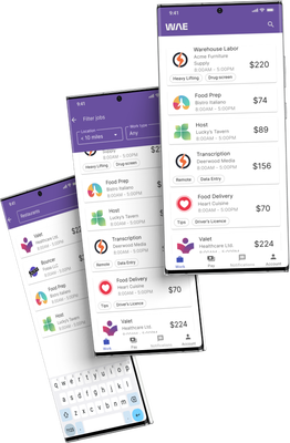
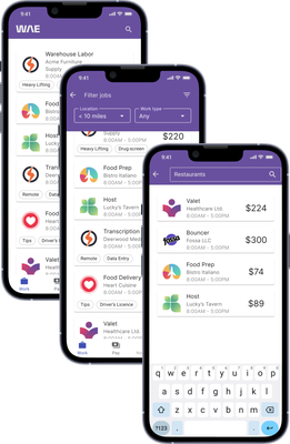
 Progress: Iteratively designing and testing every flow with real users from day one.
Core Innovation To Spark Adoption
My initial research uncovered pain points like redundant data entry and manual email workflows. However, workshops and competitive analysis revealed that the real crisis for our users was the compounding complexity of scheduling large, recurring jobs. While competitors handled one-off tasks, they all failed at bulk shift scheduling, creating massive manual bottlenecks. This was a huge feature gap and the highest-value problem we could solve.
Solution
I initiated a rapid design and testing cycle centered on this core problem, learning about the current inefficient workflows involving emailing spreadsheets. My hypothesis was that our solution could feel intuitive by using UI and interaction patterns similar to the spreadsheets our users were already familiar with.
I built a series of interactive prototypes and tested them iteratively with real clients and end-users, gathering feedback to validate and refine the design with each cycle. This process allowed us to test our core assumptions and co-create the solution with the very people who would use it every day.
The feedback from these cycles directly shaped the app’s standout feature. Rather than force users into a rigid new system, we built a flexible one that mirrored their mental models. The final design included:
- A flexible spreadsheet-like interface that replicated users’ familiar tabular workflows, making complex data entry feel intuitive.
- Auto-fill and customizable templates that streamlined repetitive tasks and allowed users to adapt the tool to their unique shift requirements.
- An automated import feature to support clients still relying on spreadsheet-based workflows.
Impact
The results were immediate and dramatic. This single feature, born from iterative testing, became the core of our value proposition. Users reported a 50% reduction in the time it took to schedule large jobs, and average user satisfaction scores for the task increased from 52% to 96%. It was so effective that users consistently described it as a “game changer” for their daily operations.

Final Outcome
I knew from the start I’d be doing a rescue on this product, but it ended up being a ground-up business transformation. We started with a non-functional MVP, a misaligned team burning cash, and hemoraging stakeholder confidence. We ended with a market-validated product, a cohort of pre-sold advocates, and a scalable operational backbone designed for future growth.
The core results of this turnaround were:
- A “Game Changer” Feature: By identifying and solving the highest-value user problem, we cut scheduling time by 50% and increased user satisfaction from 52% to 96%, creating the core innovation needed for market adoption.
- A Scalable Operating System: The DesignOps engine and agile frameworks eliminated rework and created a predictable path from idea to deployment. The system was so effective that a senior developer called the documentation “the best he’d ever seen.”
- A De-Risked Business Strategy: We transformed the research process into a pre-sales pipeline, building a base of invested customers who felt ownership of the product before it even launched.
Ultimately, the most significant deliverable wasn’t just the WAE platform. It was the installation of a durable, repeatable engine for turning user needs into revenue. By fixing the operational chaos first, we had the foundation that made strategic innovation possible, ensuring the company was positioned not just to launch, but to lead. Ultimately, the most significant deliverable wasn’t just the WAE platform. It was the installation of a durable, repeatable engine for turning user needs into revenue. By fixing the operational chaos first, we created the foundation that made strategic innovation possible, ensuring the company was positioned not just to launch, but to lead.